WATERSHED
VISUALIZING CARBON-ZERO STRATEGIES FOR YOUR BUSINESS.

KLEINER PERKINS DESIGN CHALLENGE | FEATURE REDESIGN CASE STUDY
BACKGROUNDENTERING THE ‘SHED
Watershed is an enterprise climate platform that helps you measure, analyze, and reduce your business’s carbon emissions. One of the most unique and effective components of Watershed’s strategy is their individualized strategies and hands-on support for your business.
However, there is no infrastructure in place that gives users a seamless way to visualize recommendations and imagine trajectories for their business, meaning there is a roadblock to helping users feel supported and engaged by Watershed. This led to the question:
PROCESSSCAN THE BRAND
As an enterprise platform, I had minimal access to Watershed’s product aside select samples and demos. But with this, I surveyed Watershed’s business model, brand identity, and values as an organization.
Thereafter, I looked into user testimonies to understand who exactly uses Watershed and how their experience might be improved, synthesizing common problems into three central pain points:
PROCESS
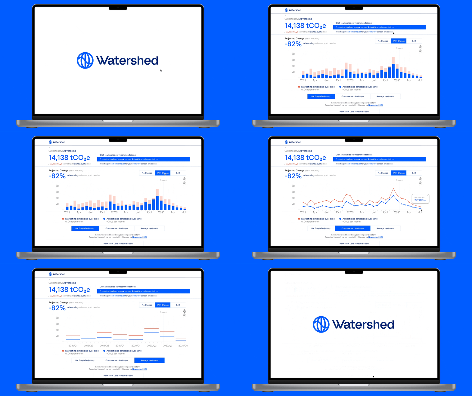
Eager to ideate and get designs in front of a user, prototyping data visualizations and interactions that can make way for in-depth understandings.

EXCERPTS FROM FIRST PROTOTYPE
I tested my design with a few users in my network to see how easily they could understand the data and navigate the dashboard, receiving feedback like:
- LESS WORDS: “The notification-like structure has a difficult time sustaining engagement and comprehension.”
- MORE VISUALIZATION: “If I were a business, I would want multiple ways to visualize the data in order to best analyze it for my needs.”
- FLUID FLOW: “This could benefit from clearer callouts and actions to create a more seamless user flow to get from point a to b.”
PROCESS
Following my first round of user testing, I made key changes responding to the synthesized needs. Then, with another round of user testing, I continued to refine my design with greater clarity on a need for:
- VISUAL IMPACT:“I want to see projected statistics that can quantify my impact.”
- INTUITIVE VISUALIZATION CONTROLS: “The information architecture feels confusing; i need an experience that feels seamless and optimizes my autonomy as a user.”

EXCERPTS FROM SECOND PROTOTYPE
THE PITCH
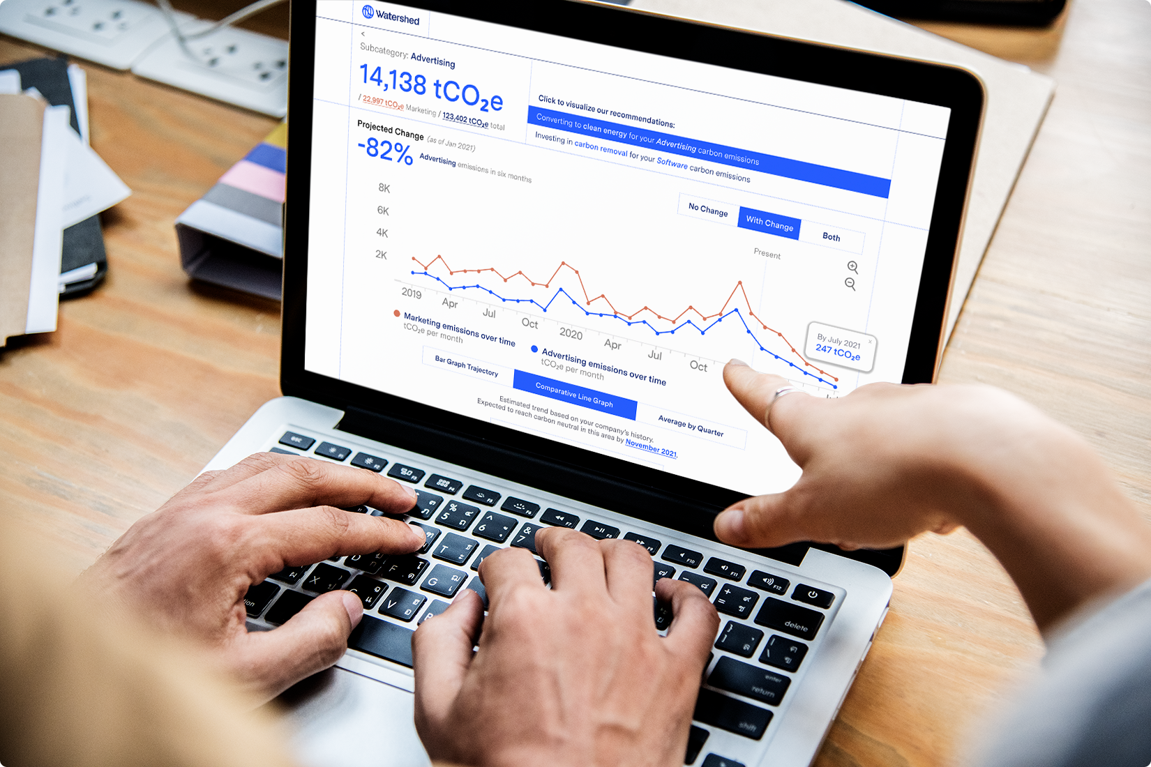
Watershed now offers extensive data visualization options to help you better comprehend and analyze our tailored climate recommendations for your business.
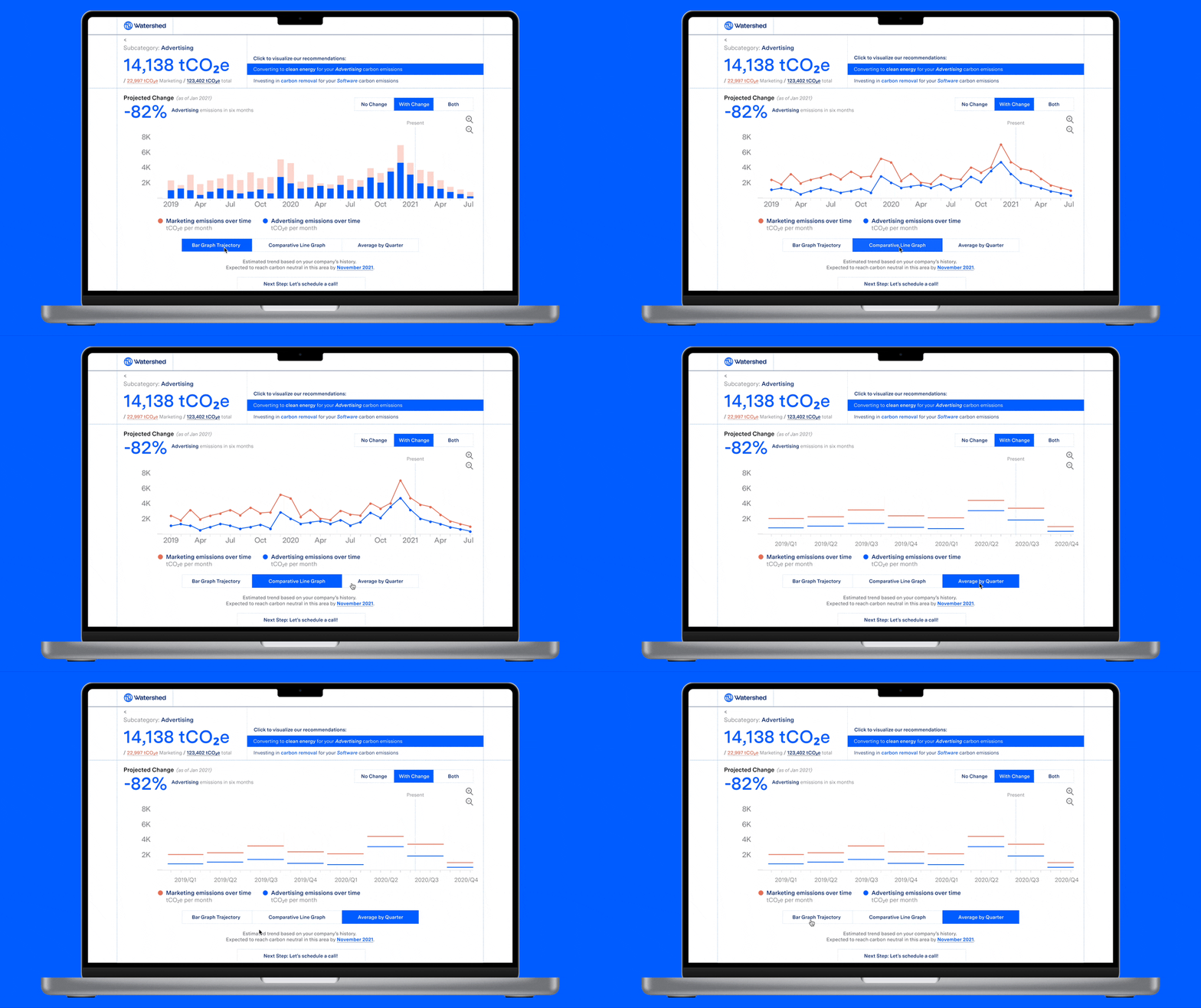
KEY FEATURES
Toggle between different visualization tools, depending on your business needs.
KEY FEATURES
Compare NO-CHANGE v. CHANGE projections against each other, seperately or simultaneously.

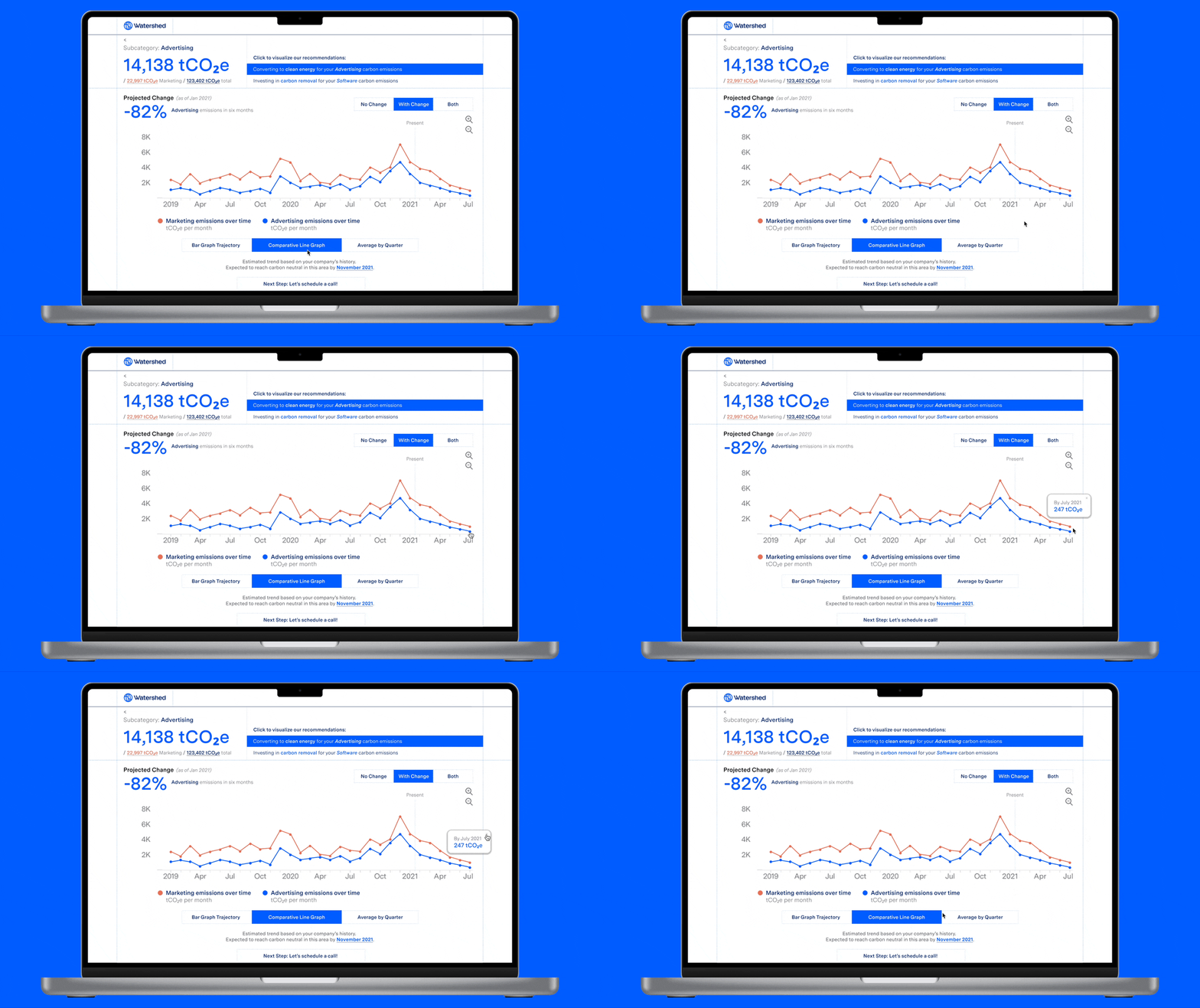
KEY FEATURES
Analyze specific data points to help you gain additional insight on your business.
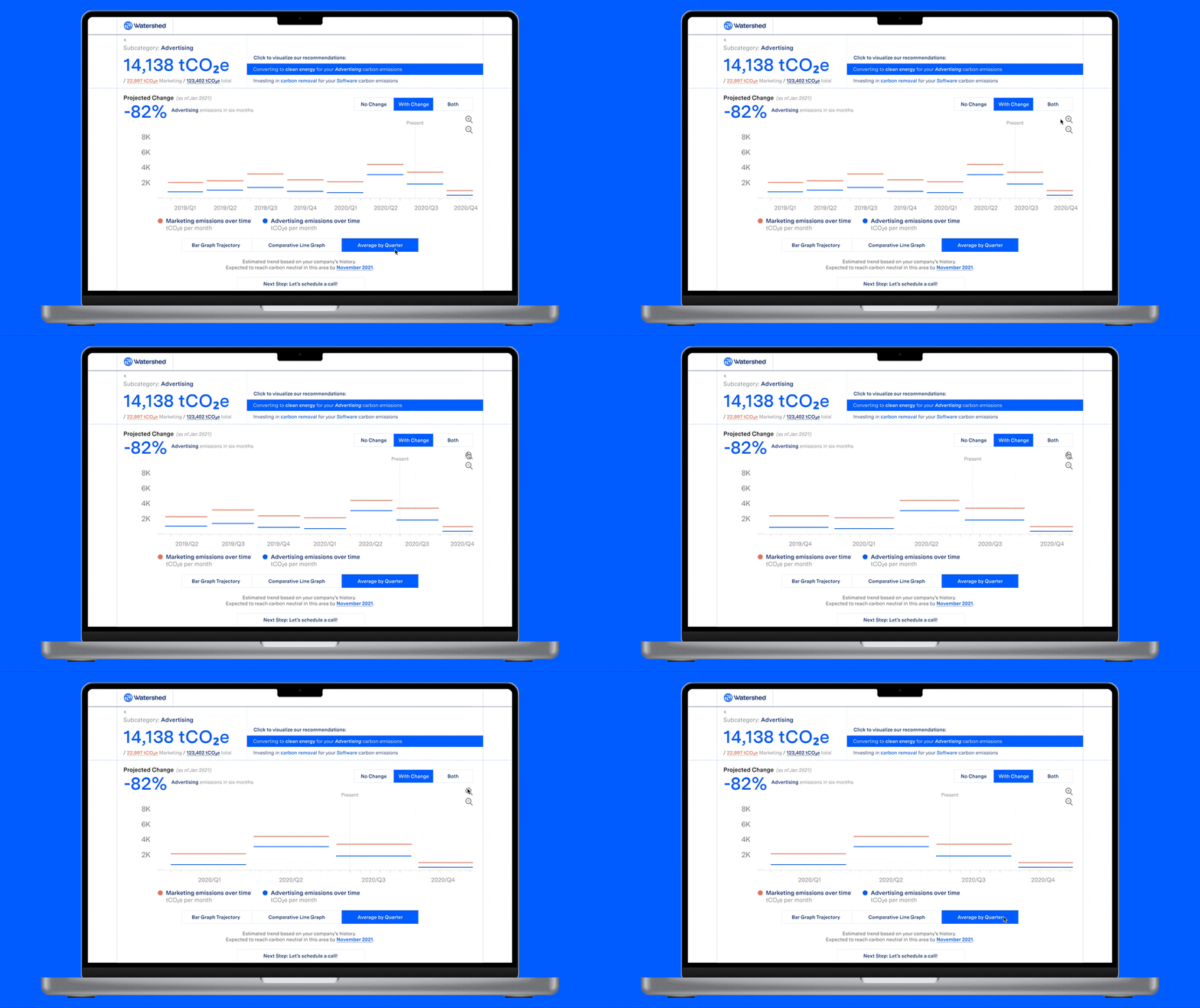
KEY FEATURES
Zoom in and out on your business projections to scale your timeline.
Now, you can better understand what different climate strategies can look like for your business. And if you’re interested in pursuing a particular recommendation, hop on a call with us to learn how to implement the change and flip the carbon curve.
CONCLUSION
In a world where this feature was shipped, I would seek to create business metrics that would be able to measure the comprehension and effectiveness of this visualization feature. Possible avenues to research impact include:
- CONVERSION RATES: Analyzing the percentage of users who schedule a call after engaging with the feature
- FOCUS GROUPS + SURVEYS: Conducting qualitative research to shed light on where the feature can expand and better meet users’ growing needs.
ENTERING THE ‘SHED
Watershed is an enterprise climate platform that helps you measure, analyze, and reduce your business’s carbon emissions. One of the most unique and effective components of Watershed’s strategy is their individualized strategies and hands-on support for your business.
However, there is no infrastructure in place that gives users a seamless way to visualize recommendations and imagine trajectories for their business, meaning there is a roadblock to helping users feel supported and engaged by Watershed. This led to the question:
HOW CAN WE HELP USERS BETTER UNDERSTAND AND OPTIMIZE THEIR CARBON-ZERO STRATEGIES FOR THEIR BUSINESS?
PROCESS
SCAN THE BRAND
As an enterprise platform, I had minimal access to Watershed’s product aside select samples and demos. But with this, I surveyed Watershed’s business model, brand identity, and values as an organization.
Thereafter, I looked into user testimonies to understand who exactly uses Watershed and how their experience might be improved, synthesizing common problems into three central pain points:
- Better VISUALIZE tailored recommendations for cutting carbon
- Effectively ANALYZE proposed carbon options
- Uncover OPPORTUNITIES to have greater impact
PROCESS
QUICK N’ DIRTY
Eager to ideate and get designs in front of a user, prototyping data visualizations and interactions that can make way for in-depth understandings.

EXCERPTS FROM FIRST PROTOTYPE
I tested my design with a few users in my network to see how easily they could understand the data and navigate the dashboard, receiving feedback like:
- LESS WORDS: “The notification-like structure has a difficult time sustaining engagement and comprehension.”
- MORE VISUALIZATION: “If I were a business, I would want multiple ways to visualize the data in order to best analyze it for my needs.”
- FLUID FLOW: “This could benefit from clearer callouts and actions to create a more seamless user flow to get from point a to b.”
PROCESS
HONING IN
Following my first round of user testing, I made key changes responding to the synthesized needs. Then, with another round of user testing, I continued to refine my design with greater clarity on a need for:
- VISUAL IMPACT:“I want to see projected statistics that can quantify my impact.”
- INTUITIVE VISUALIZATION CONTROLS: “The information architecture feels confusing; i need an experience that feels seamless and optimizes my autonomy as a user.”

EXCERPTS FROM SECOND PROTOTYPE
THE PITCH
VISUALIZE BETTER, UNDERSTAND MORE
Watershed now offers extensive data visualization options to help you better comprehend and analyze our tailored climate recommendations for your business.

KEY FEATURES
VISUALIZE THE TRENDS
Toggle between different visualization tools, depending on your business needs.

KEY FEATURES
VISUALIZE THE CHANGE
Compare NO-CHANGE v. CHANGE projections against each other, seperately or simultaneously.

KEY FEATURES
VISUALIZE THE DETAILS
Analyze specific data points to help you gain additional insight on your business.

KEY FEATURES
VISUALIZE THE SCALE
Zoom in and out on your business projections to scale your timeline.

Now, you can better understand what different climate strategies can look like for your business. And if you’re interested in pursuing a particular recommendation, hop on a call with us to learn how to implement the change and flip the carbon curve.
CONCLUSION
MEASURING SUCCESS
In a world where this feature was shipped, I would seek to create business metrics that would be able to measure the comprehension and effectiveness of this visualization feature. Possible avenues to research impact include:
- CONVERSION RATES: Analyzing the percentage of users who schedule a call after engaging with the feature
- FOCUS GROUPS + SURVEYS: Conducting qualitative research to shed light on where the feature can expand and better meet users’ growing needs.
