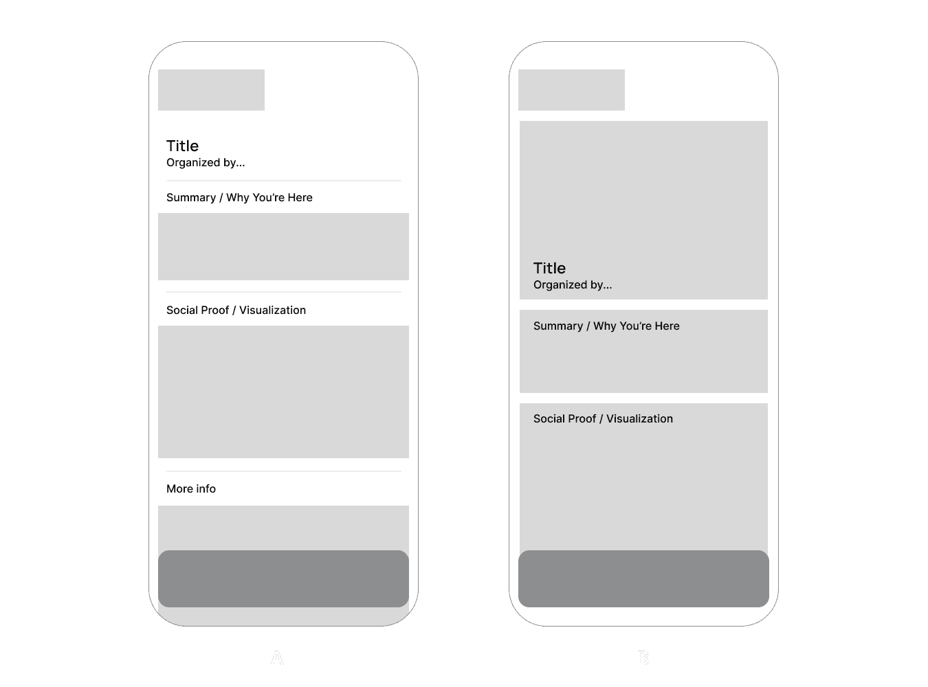
case studies
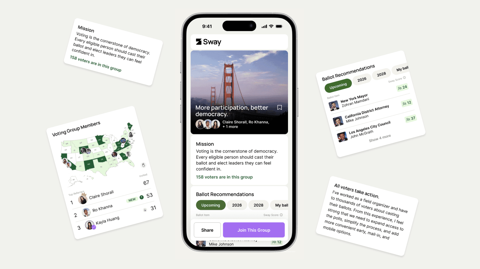

Through research, I discovered how our users' political views didn't fit neatly into templates; they wanted flexibility and versatility to reach an audience who scrolls fast.
I solved this need by designing a media-first, modular system — users compose pages from flexible content blocks (video, images, text, endorsements) rather than filling out a fixed layout.
A/B testing across 20 users, I chose a UI that best gave the expressiveness of a social feed with the structure of a voter guide.

Early usage and dropoff rates showed that visitors didn't understand what Sway was.
Testing with focus groups, I developed the design of the Ballot Recommendations module to clearly communicate Sway as a voter guide product.
Additionally, I strategically moved the module to be above the fold to reduce friction for a user to "get it".
After its implementation, comprehension and engagement jumped.
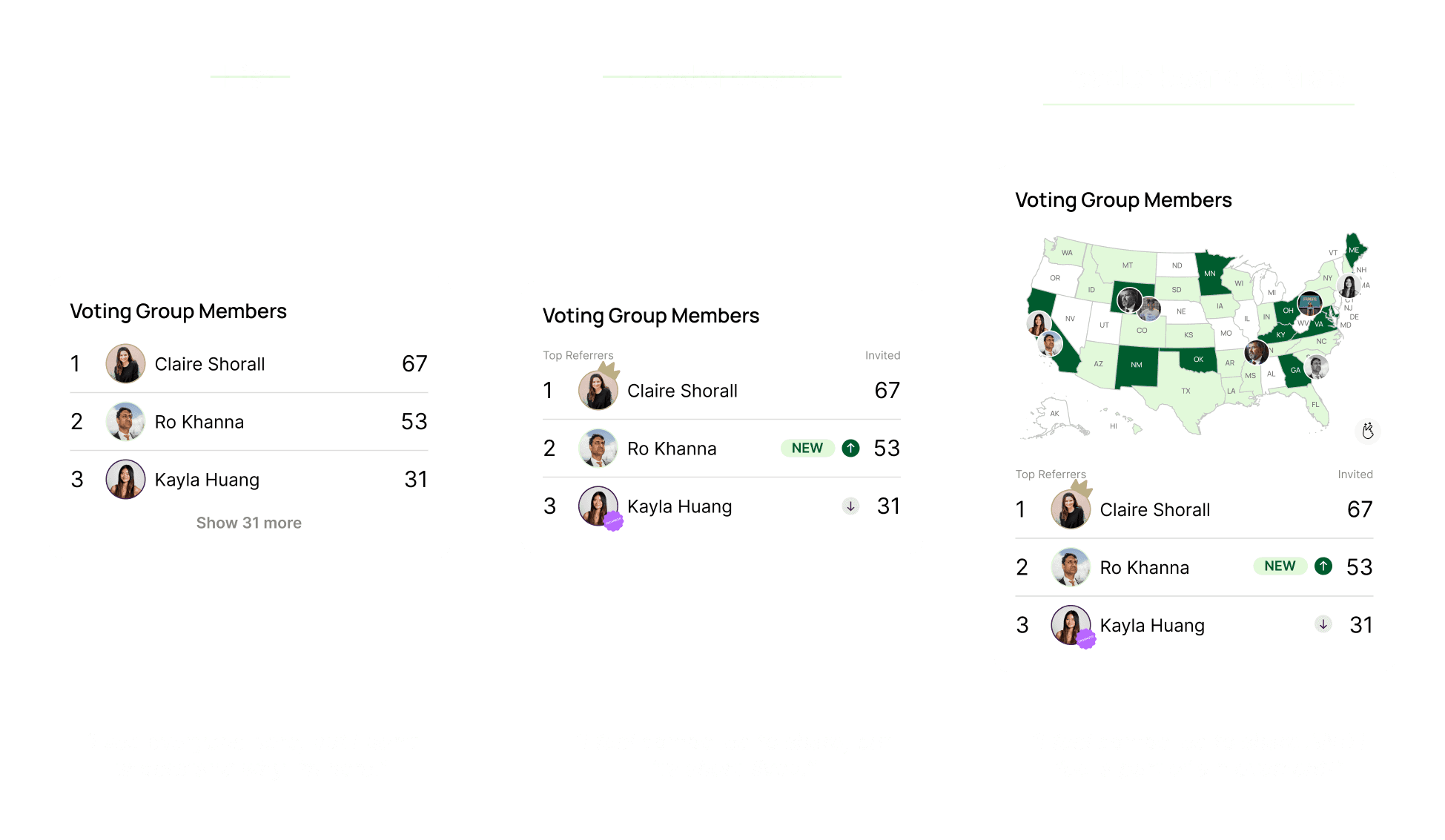
One of the biggest conversion levers was if a supporter could feel the influence that a voting group on Sway had.
I iterated on a "social proof" module, deciding to leverage both a leaderboard to highlight supporters who were referring the movement, and a heat map to show the density of supporters across the country.
After both, group sizes and conversion rates tripled.


Sway x NYC Marathon T-Shirts

Event Prompt Cards

Election Day Totes
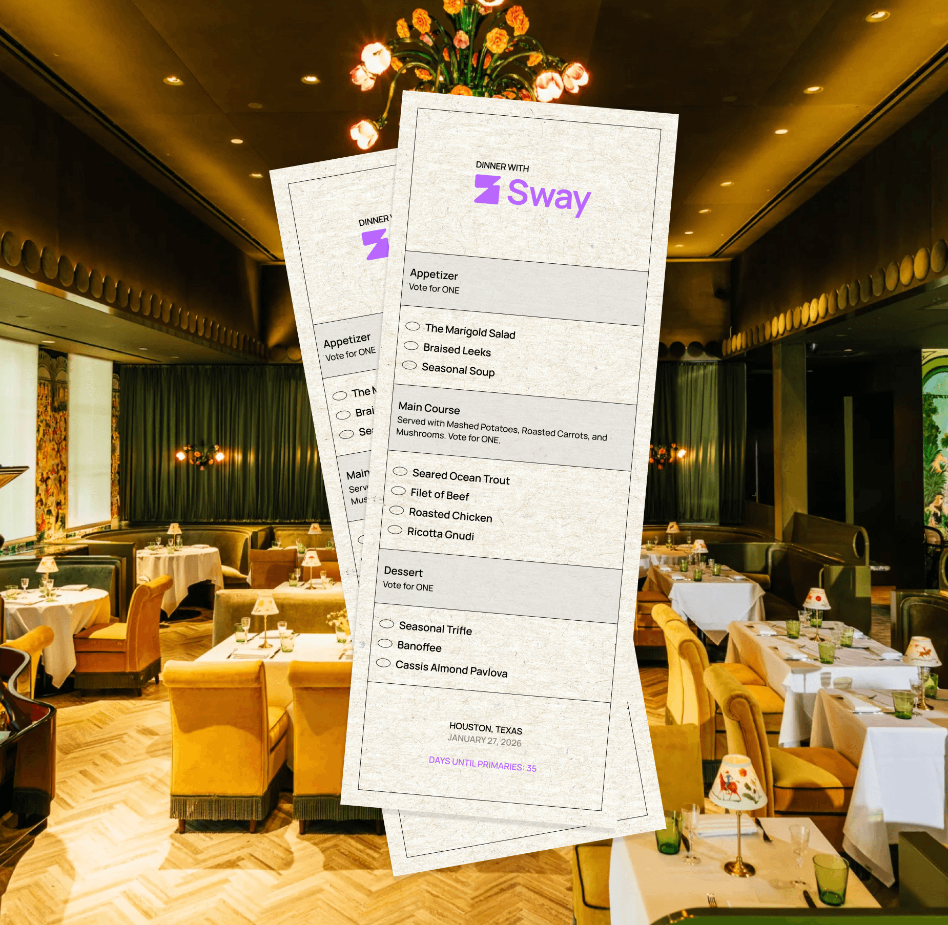
Dinner with Sway Menus
see also
Gemini Privacy Trace
Prior Foundry
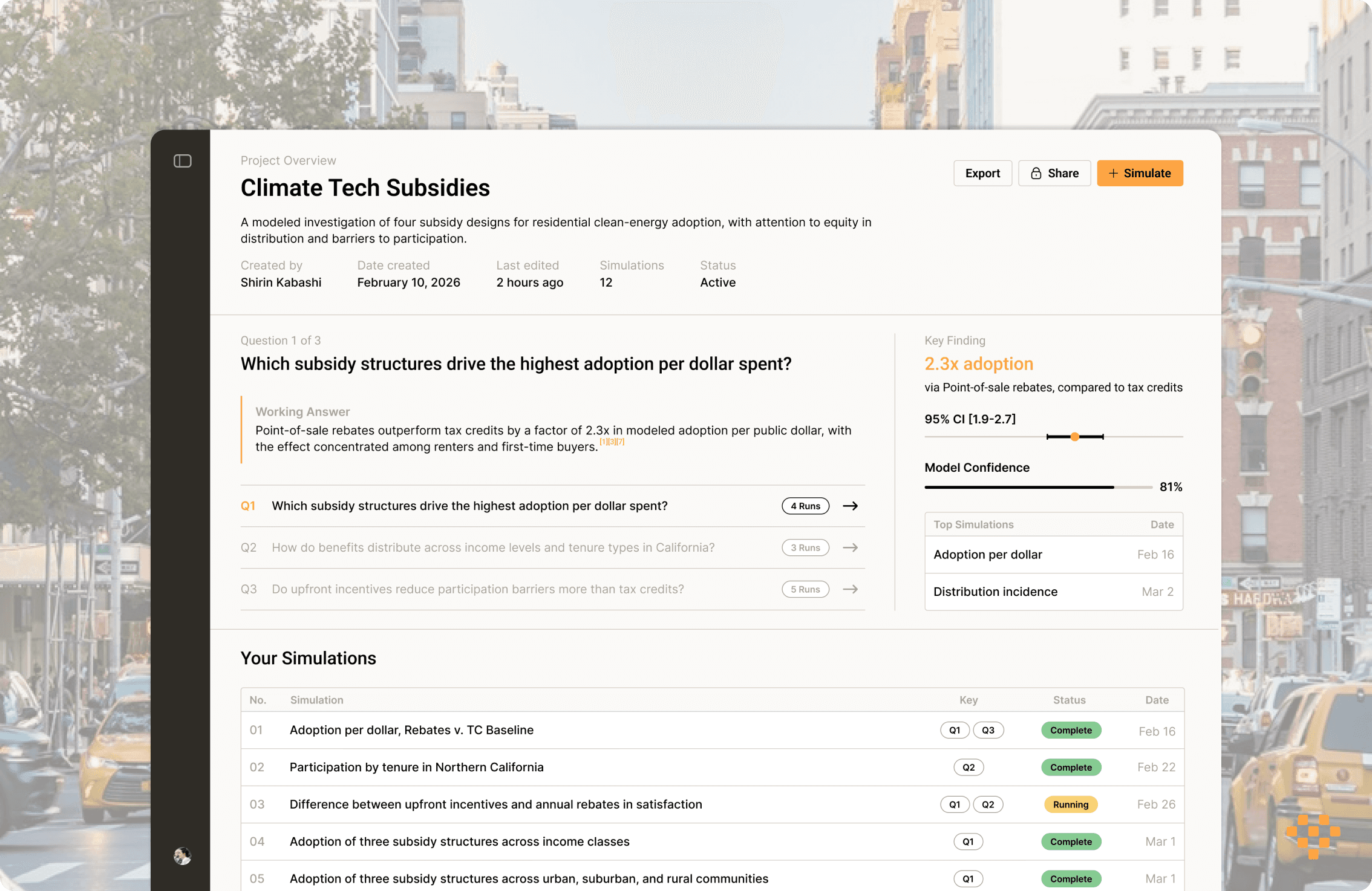
Agentic Policy Simulation